BNCRC Rebrand
Identity Design Project
Fall 2017
As part of an Identity Design course at the University at Buffalo, I developed a full rebrand for the Buffalo Niagara Community Reinvestment Coalition (BNCRC), a nonprofit focused on social and economic justice in the Buffalo-Niagara region.
The goal of the project was to create a modern, cohesive visual identity system that reflected both the organization’s mission and the character of the region it serves.
The Brand
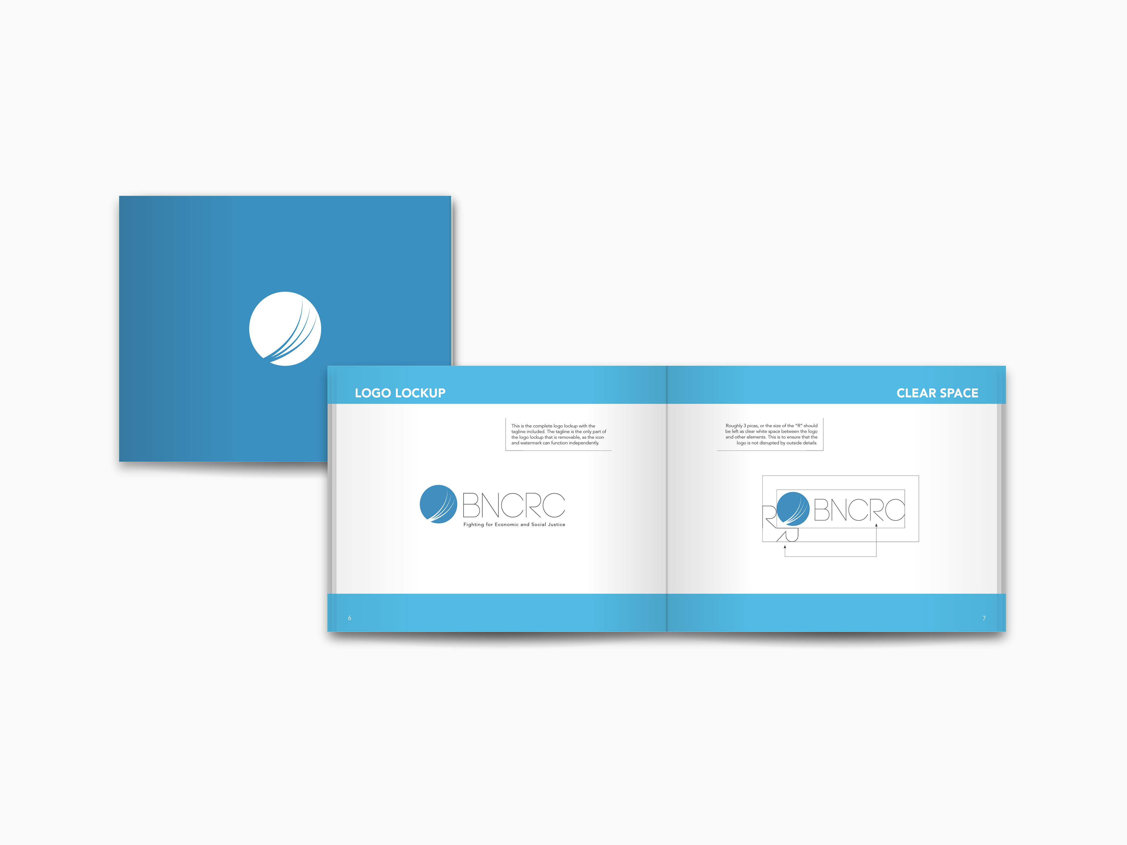
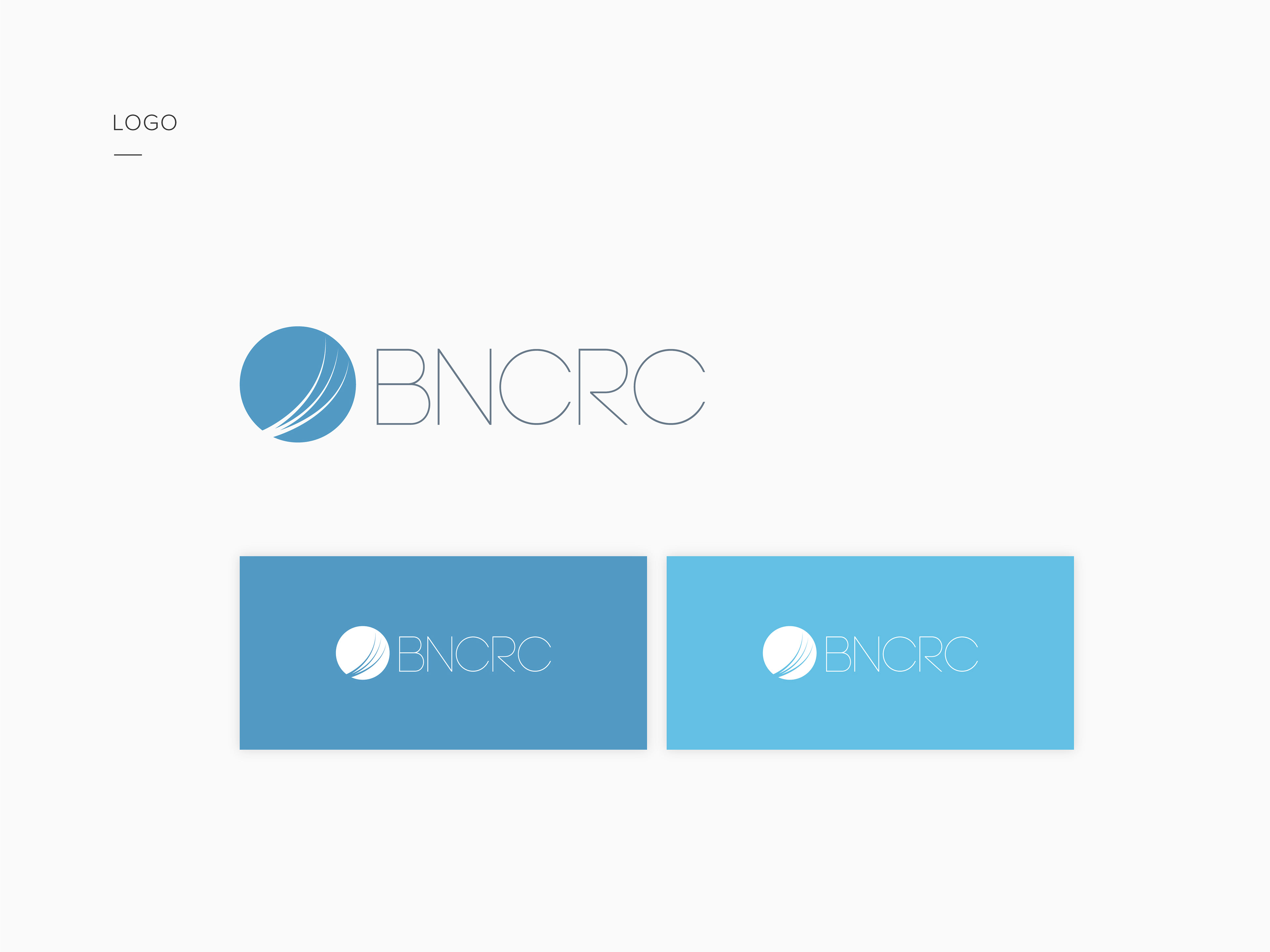
The identity system introduced a redesigned logo built around circular form and directional flow. The mark conceptually references cycles of poverty and systemic barriers while incorporating visual cues inspired by the motion and energy of Niagara Falls, symbolizing movement toward opportunity and progress.

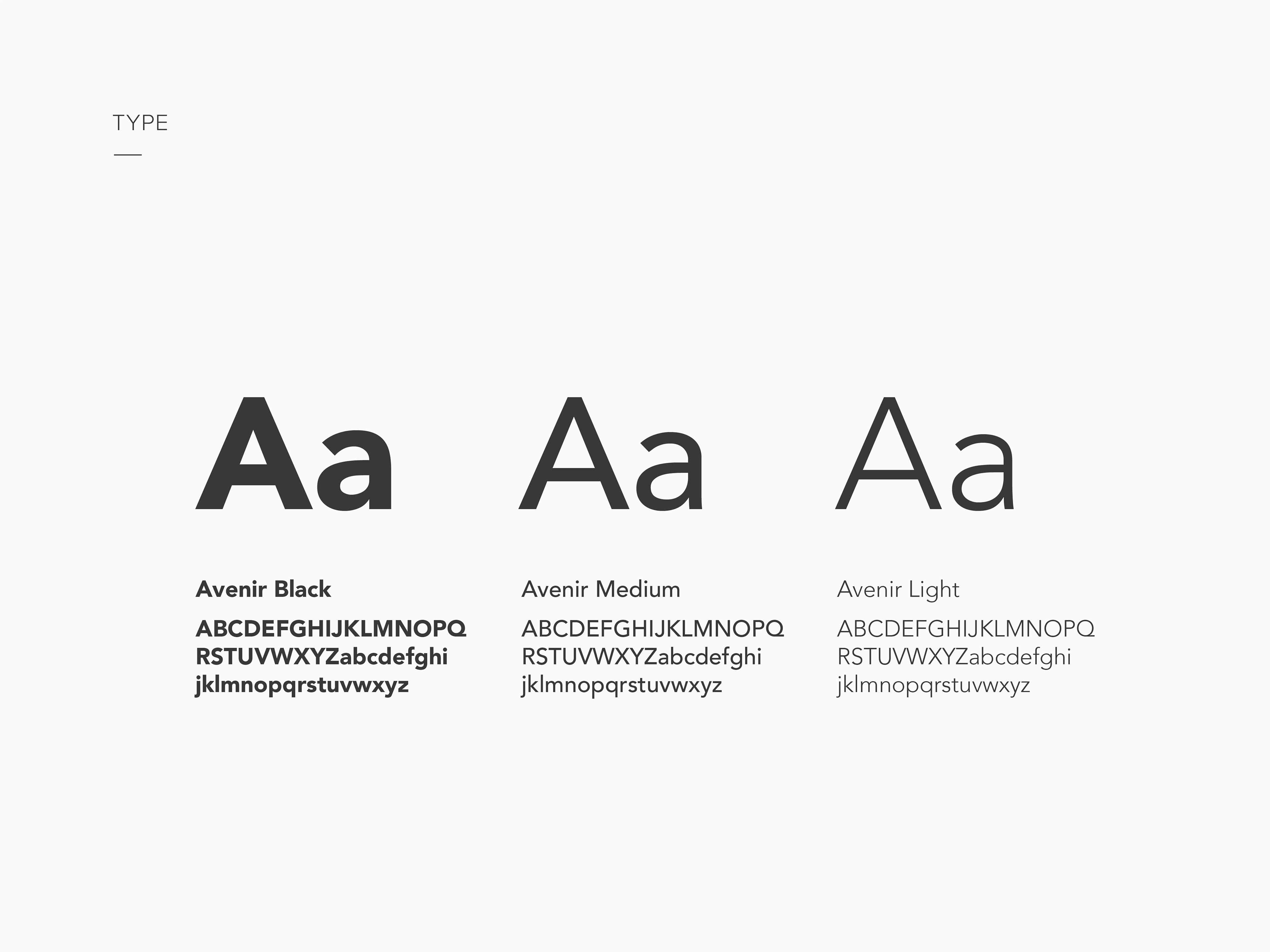
The Guide
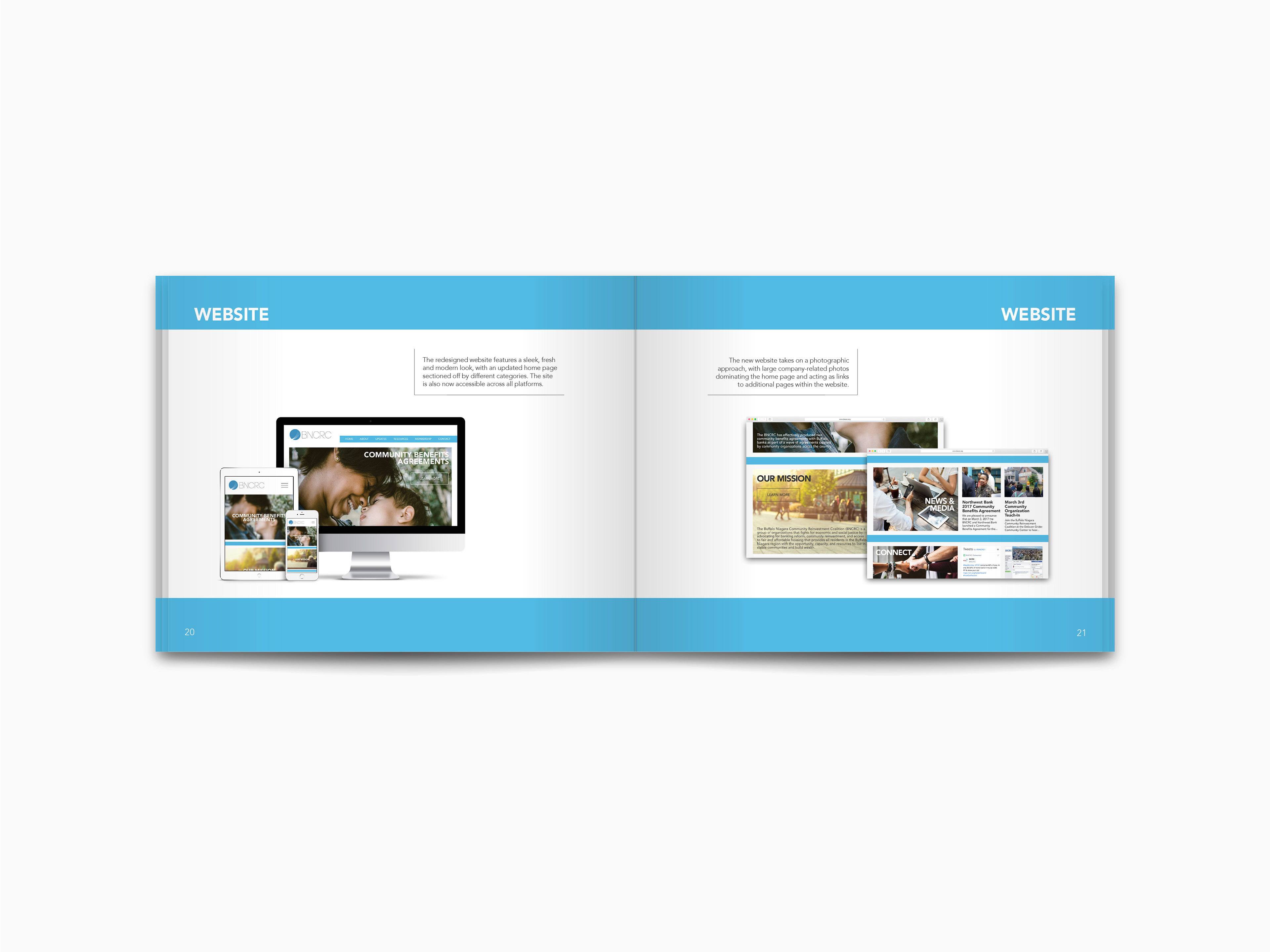
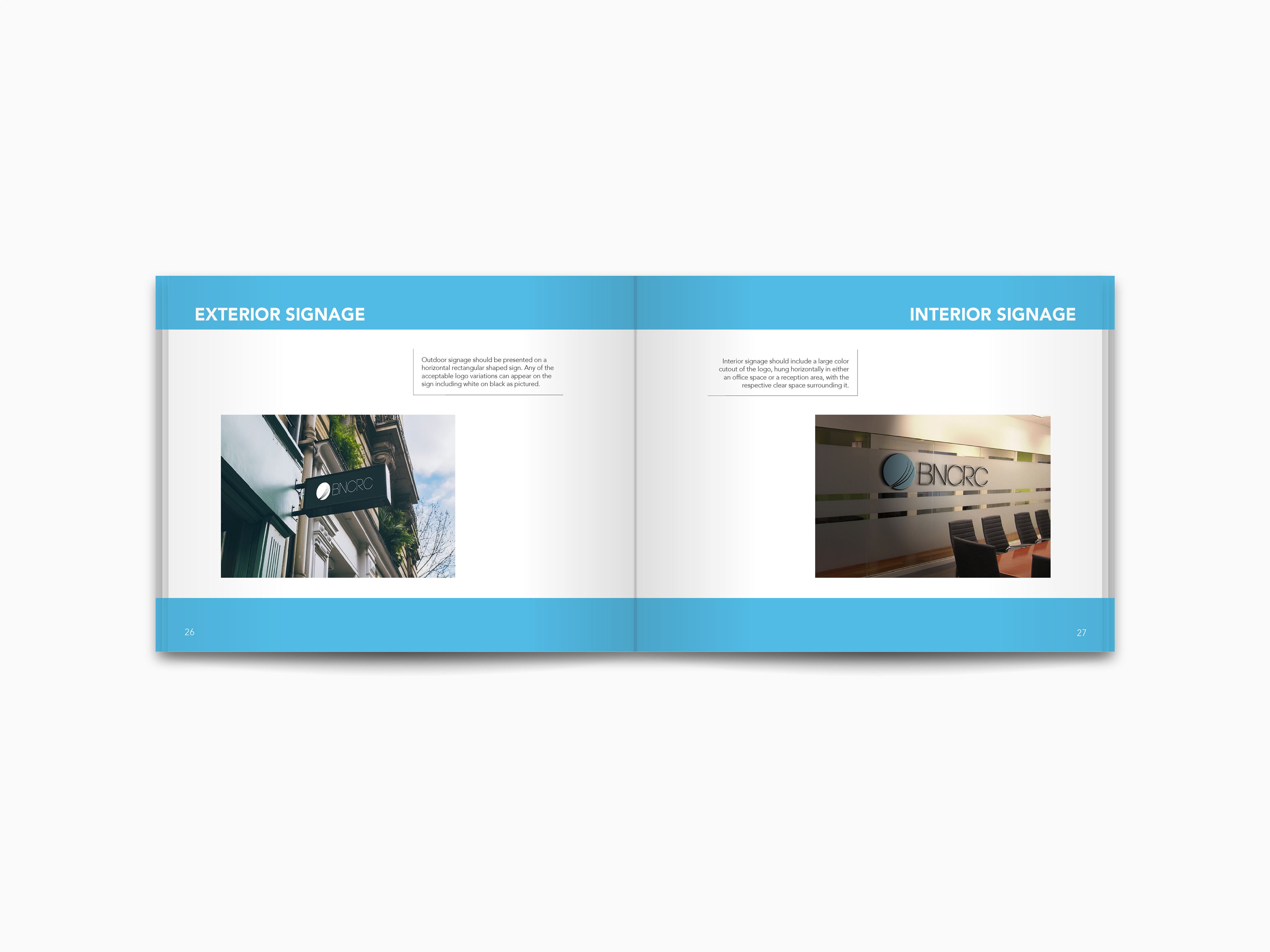
A comprehensive 32-page brand standards guide was developed to define the full identity system, including logo usage, graphic elements, typography, color systems, and photographic direction. The guide outlines proper application of the brand across print and digital materials to ensure consistency and clarity.